Industry
Ag & Trading
Client
Cargill
Role
Lead Product Designer

Alpha – Design System

  • Figma UI Kit
  • Design Tokens
  • Documentation
  • Governance

My Contribution

Owned

  • Figma component library
  • Colour system and token naming
  • Documentation portal

Led

  • Design in a four-person system squad
  • Alignment of design and engineering
  • Governance, releases and updates

Impact

  • Adopted by all 20+ apps
  • 40% less design-to-dev time
  • 100+ components, 3,000+ variables

The Problem

Cargill’s Trading & Analytics organisation runs 20+ business-critical apps, used daily by hundreds of people worldwide. Each was built in its own silo, over years, by different designers and developers.

In practice, that meant:

  • Inconsistent UI in production
  • Multiple, competing Figma and UI libraries
  • Confusion between design and development about implementation
  • No shared design or accessibility standards
  • Slower delivery across every team

20+ apps, built in silos

Separate code bases, separate UI, and libraries nobody owned.

BEFORE

Each app used similar colours, but its own components, hierarchy and UX. That led to inconsistency across products, for users and their workflows.

  • No dedicated owners
  • No versioning
  • Dark mode only
  • Unclear token names

Alpha: one system for every app

Tokens, then components, then patterns. Versioned, documented and shared.

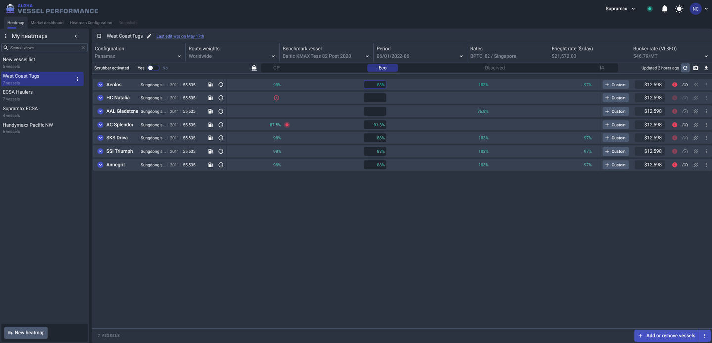
Vessel Performance: BEFORE
Vessel Performance app before Alpha: hand-picked dark colours and one-off components
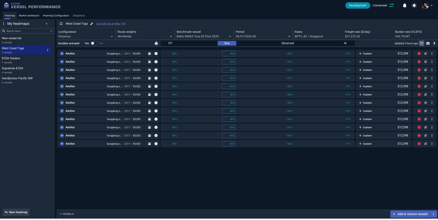
Vessel Performance: AFTER
Vessel Performance app rebuilt with Alpha tokens and components
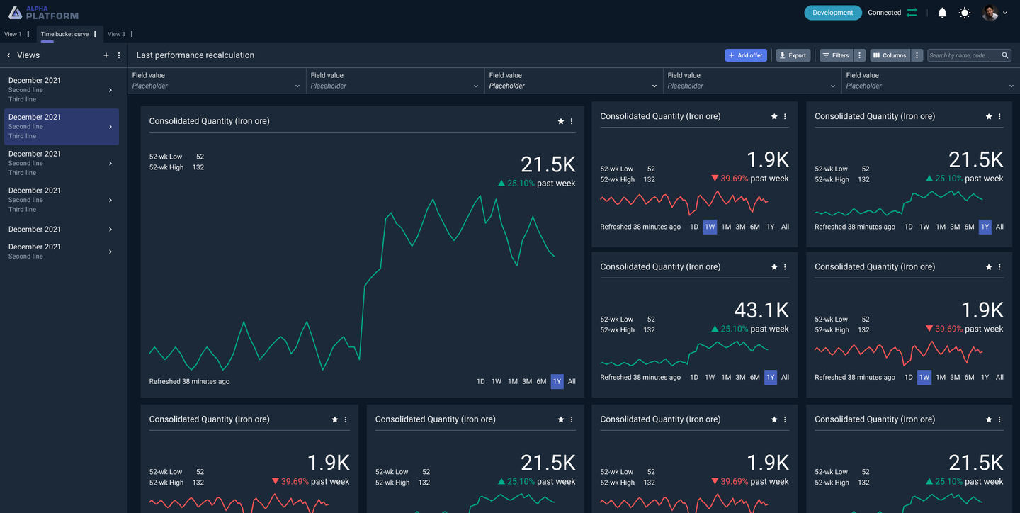
Card layout mockup: DARK THEME
Card layout mockup in the dark theme
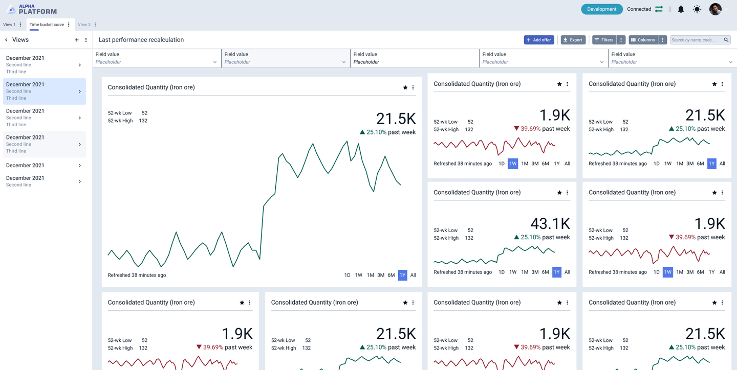
Card layout mockup: LIGHT THEME
The same card layout mockup in the light theme

The Challenges

We didn’t start again. With 20+ apps in production, a clean-slate release would have broken them, so we rebuilt Alpha in place and versioned it, from the foundations up: tokens first, then components, then patterns.

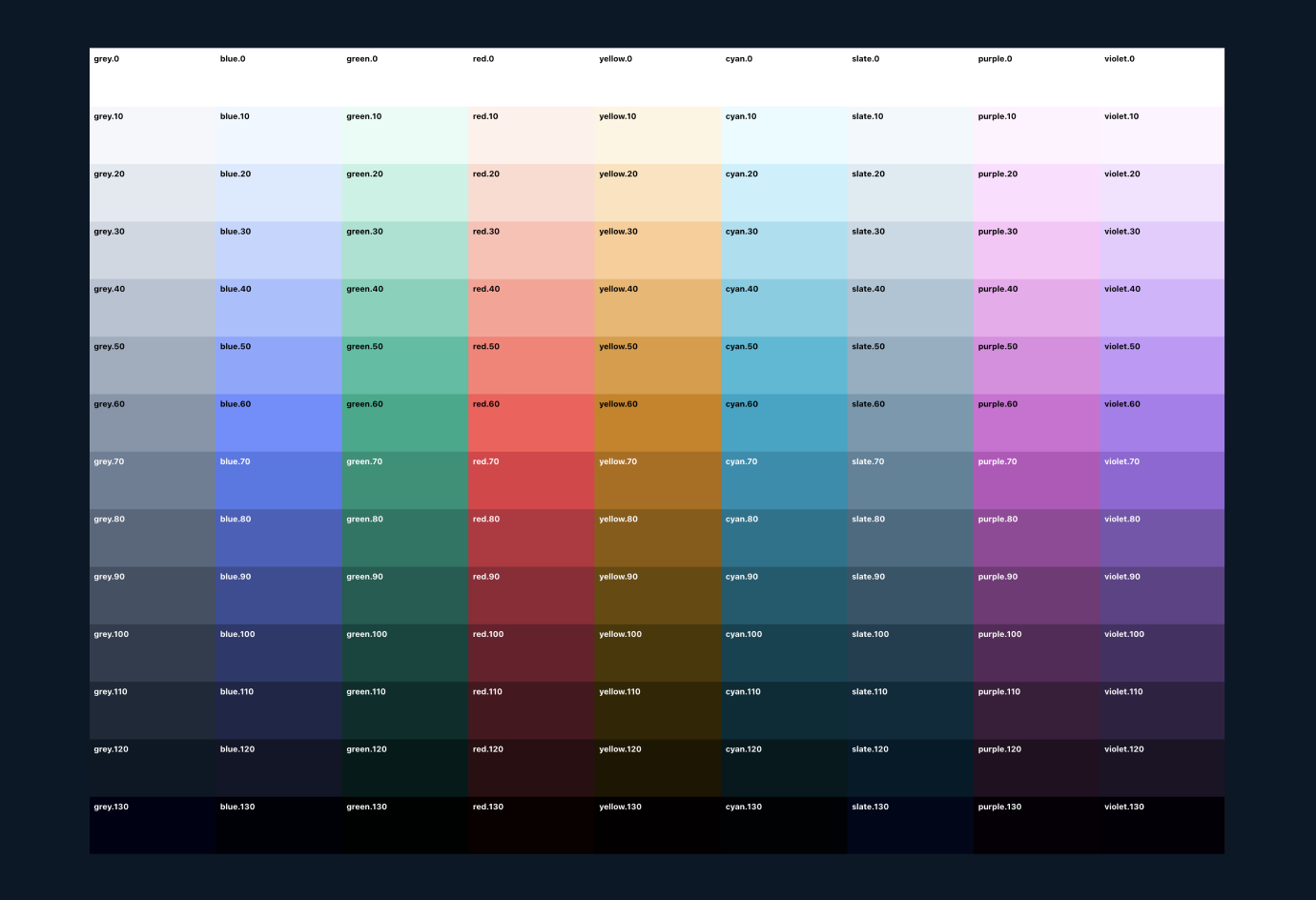
I started by auditing every component and colour. The old palette had 56 colours, picked by hand and tuned for dark mode. Hover and selected states broke in the light theme, form errors only worked on dark backgrounds, and placeholder text was barely visible. I helped rebuild the palette in the LCH colour space, so colours at the same step look equally light and equally saturated, and contrast is predictable in both themes.

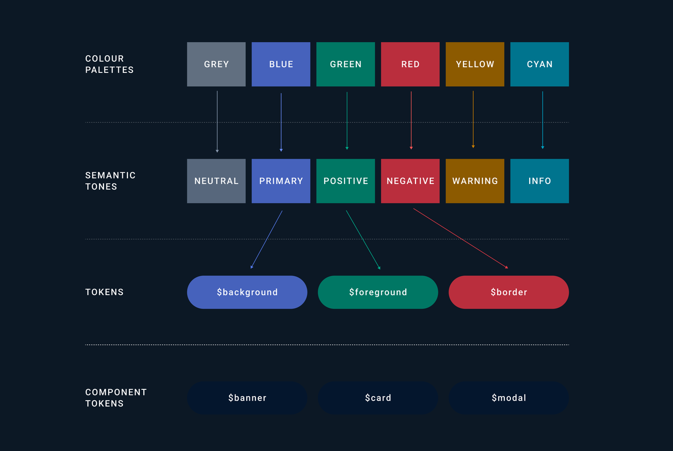
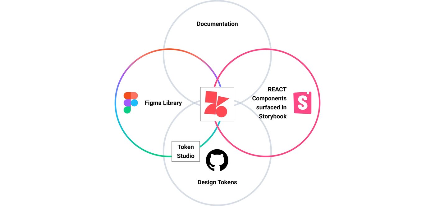
The core decision was tokens. Palettes feed six semantic tones (neutral, primary, positive, negative, warning, info), and every tone has the same set of tokens. Designers apply them in Figma with Tokens Studio, they sync through GitHub, and developers use them in React with code completion and type safety. A change made in design or in code reaches both.

Token pipeline: palettes feed semantic tones, synced between Figma Tokens Studio, GitHub and React

The Product

LCH colour palettes stepping from 0 to 130

Using the LCH colour model, each core colour steps from 0 (lightest) to 130 (darkest) for consistent gradation.

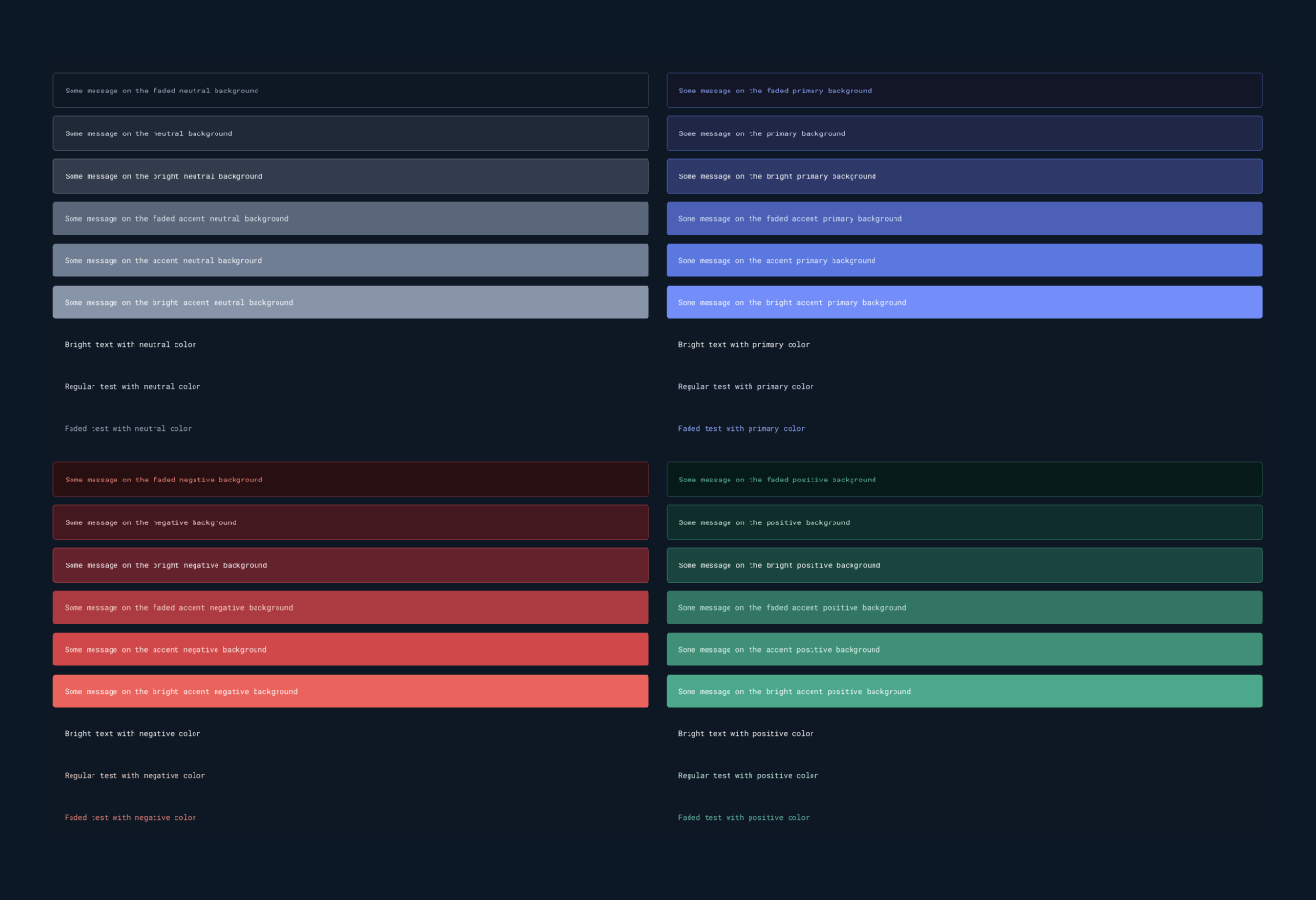
Semantic tokens for each tone with contrast checks

The same semantic tokens in every tone, checked for accessible contrast and WCAG standards.

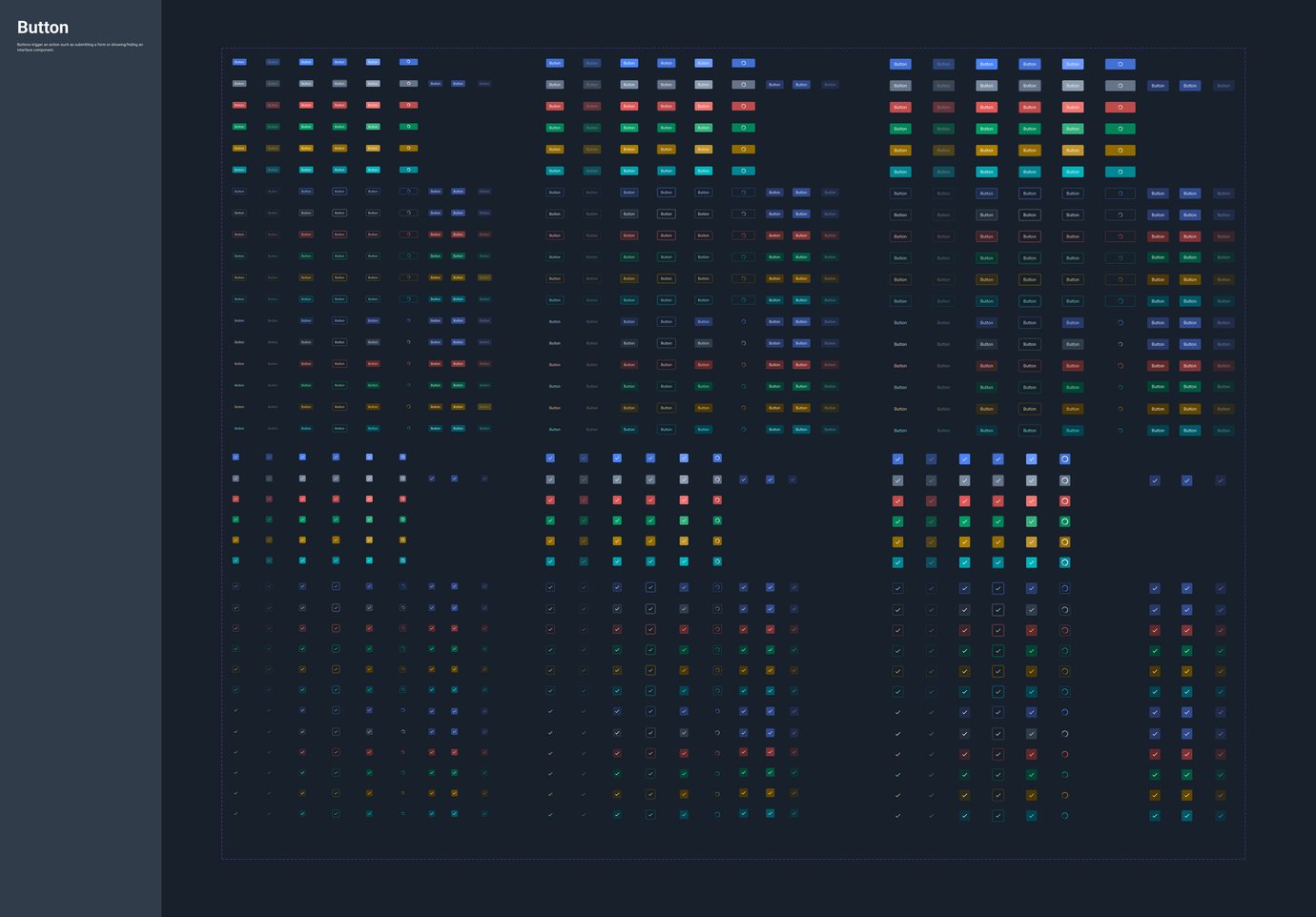
Components in the shared Figma UI library

100’s of Figma components in the shared UI Library, rebuilt with tokens and aligned with React.

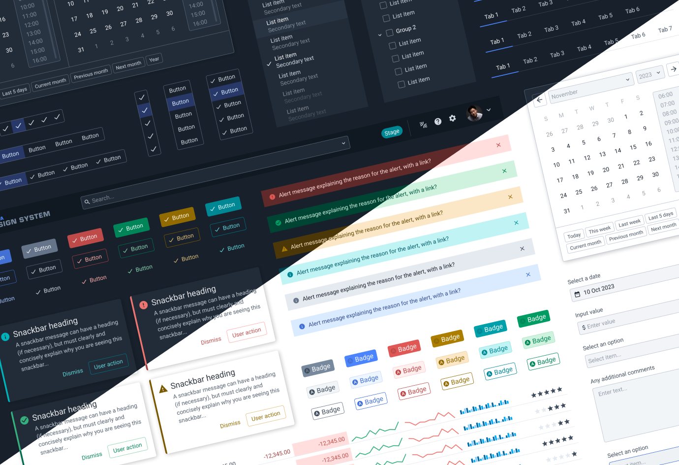
Components shown in dark and light themes

Every component built for dark and light themes. Controlled and managed by a centralised token system.

Naming as infrastructure

Token names were part of the original problem. They had no structure behind them, didn’t work with theming, and nobody could tell when or where to use them.

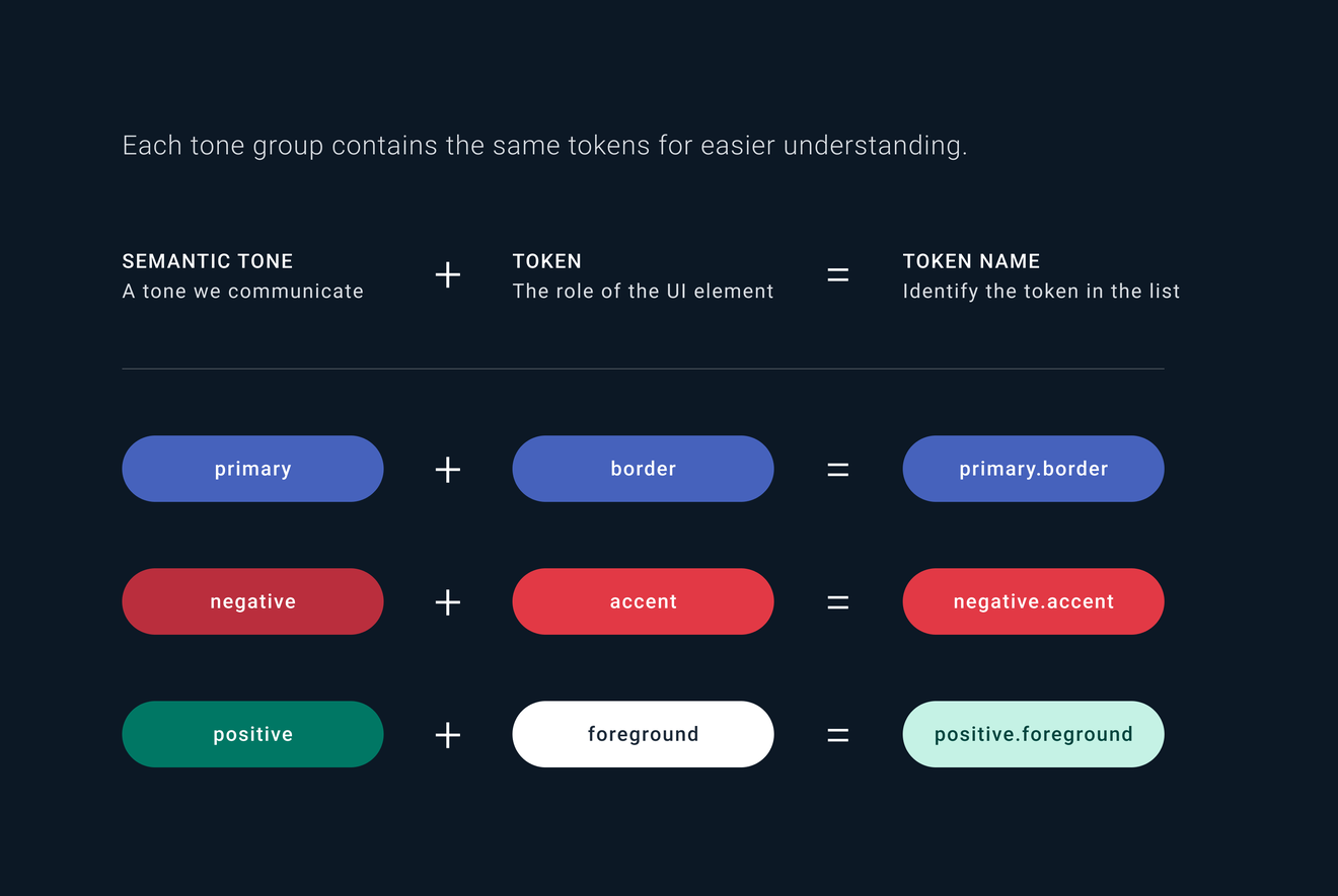
I set one naming pattern: tone, then role. primary.border, negative.accent, positive.foreground. Every tone has the same roles, so if you know one, you know them all. Each token points to a different palette step per theme, which is what makes switching between dark and light reliable.

Token naming: tone then role, mapped to palette steps for dark and light themes

Adoption

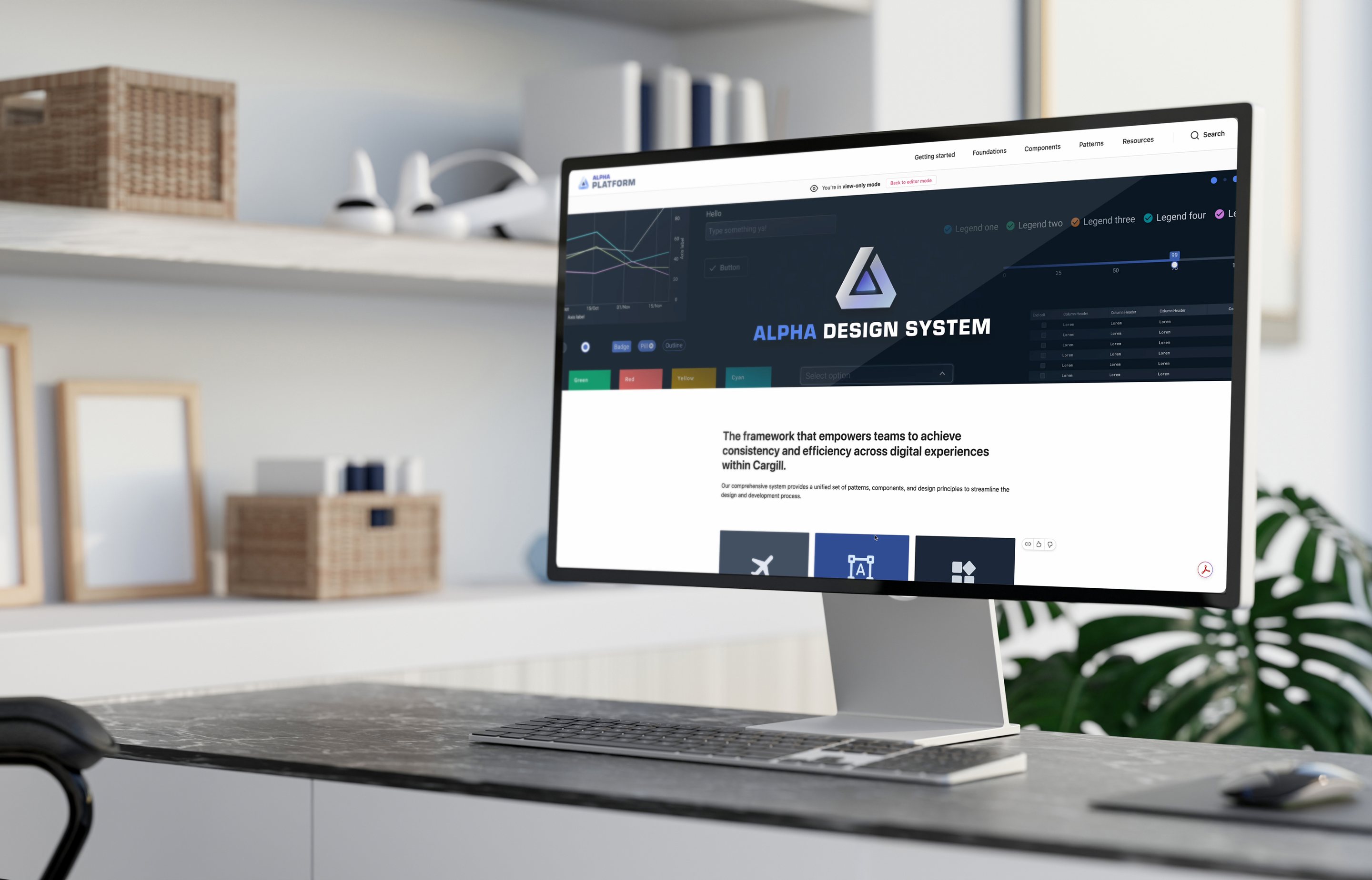
Then people needed to know how to use it. I designed the documentation portal on ZeroHeight, linked to Figma and Storybook, as the single source of truth for designers and offshore developers alike.

App teams could contribute too, through a contribution model, so the system could grow without splitting again.

The Alpha documentation portal on ZeroHeight
A component page in the Alpha documentation

The Result

Alpha became the foundation for every Trading & Analytics app. Design-to-development time and effort dropped by 40%, UI became consistent across global teams, and all 20+ apps adopted it, new and legacy.

Design and engineering now work from the same tokens, the same components and the same source of truth.

20+Apps on one system, new and legacy.
40%Less design-to-development time and effort.
100+Figma components, aligned with React.
3,000+Variables, defined as tokens.
Alpha card layouts in dark and light themes side by side